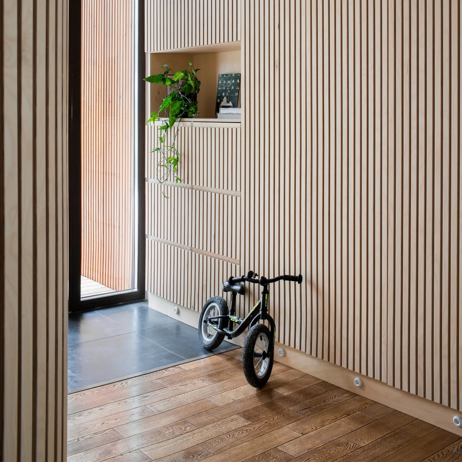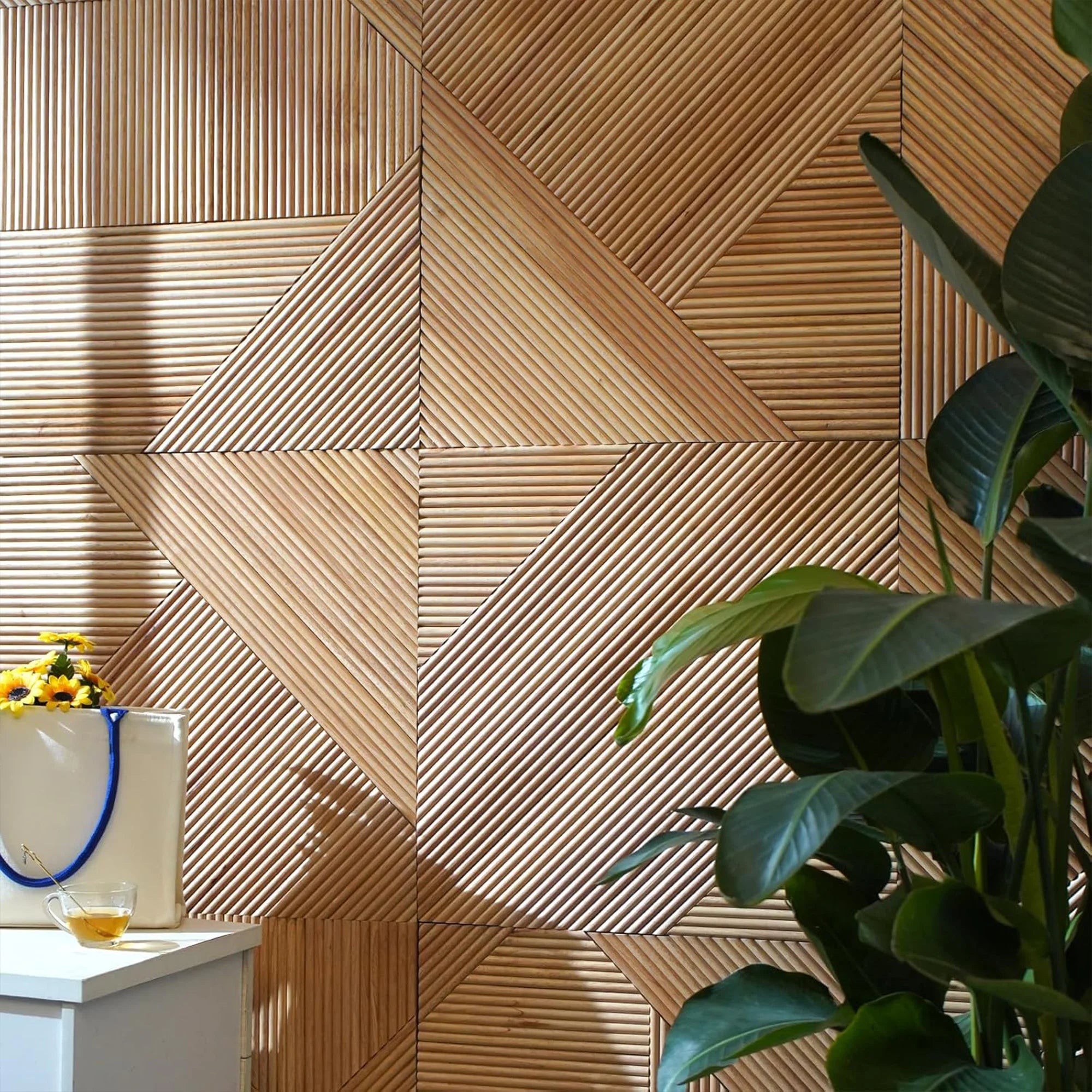
Brown wall panels are one of the most versatile choices in the colour spectrum — warm enough to feel inviting, neutral enough to pair with almost anything, and available in a range of tones from light caramel to deep espresso. At The Panel Hub, our brown wall panels span the full range of warm wood tones, and they’re among our most popular finishes. The challenge — and the skill — is choosing the right shade for your room and knowing how much to use.
Contents
- What We Mean by Brown Wall Panels
- Where Brown Wall Panels Work Well
- Living rooms
- Bedrooms
- Dining rooms
- Home offices
- Choosing the Right Shade of Brown
- Light warm brown (oak and honey tones)
- Mid-brown (walnut and caramel tones)
- Dark brown (espresso and deep mahogany tones)
- What to Pair With Brown Wall Panels
- Common Mistakes to Avoid
- Our Brown-Tone Panel Collections
What We Mean by Brown Wall Panels
In wood paneling, ‘brown’ covers a significant spectrum: from the light, sandy brown of pale oak through the mid caramel tones of natural walnut to the dark, rich brown of wenge or ebony finishes. When we talk about wood wall panels in brown tones, we’re talking about the range of warm, earthy hues that give a panel its character — and choosing between them requires understanding both the tone and the depth you want to introduce into the room.
Where Brown Wall Panels Work Well
Living rooms
A brown-toned panel on a living room feature wall — particularly behind a sofa or as a TV wall — adds the warmth and grounding quality that makes a living room feel complete. Mid-brown panels (walnut, natural oak) are the most versatile here, working with both light and dark furniture and creating a focal point without dominating the room.
Bedrooms
Brown panels on the bedhead wall create a warm, enveloping backdrop that’s harder to achieve with paint. The natural grain and texture of wood paneling add a quality that solid colour can’t replicate. For bedrooms, mid to light brown tones work best — they’re warm enough to feel restful without making the room feel dark.
Dining rooms
In dining rooms, a paneled feature wall in a warm mid-brown adds depth and intimacy to the space — exactly the quality that makes a dining room feel inviting for longer meals and gatherings. Our SoundPanel™ acoustic slat panels in walnut and mid-oak finishes are a popular choice here, reducing the echo from hard surfaces while adding warmth and texture.
Home offices
In a home office, a brown-toned panel behind the desk creates a professional, warm backdrop for video calls and adds the sense of structure and focus that a bare white wall can’t achieve. It reads as considered and calm rather than decorative.
Choosing the Right Shade of Brown
Light warm brown (oak and honey tones)
Light brown finishes — pale oak, honey, and sandy tones — are the most versatile and work in the widest range of spaces. They add warmth without weight, suit rooms of any size, and pair easily with white, cream, and neutral décor. If you’re unsure which shade to choose, start here.
Mid-brown (walnut and caramel tones)
Mid-brown finishes add more richness and depth. They suit rooms with good natural light, larger spaces, or rooms where the panel is the deliberate focal point. Our walnut wall panels offer the most popular mid-brown finishes — rich without being dark, warm without being saturated.
Dark brown (espresso and deep mahogany tones)
Dark brown finishes make a strong statement and work best on a single feature wall in a well-lit room. In darker rooms or on multiple walls, they can make the space feel enclosed. Used confidently — on one wall, in a room with good light — they create a dramatic, high-contrast result that suits both contemporary and period interiors.
What to Pair With Brown Wall Panels
Brown panels work well with: warm whites and creams for the remaining walls; natural textures (linen, wool, jute, leather); greenery (indoor plants complement warm wood tones strongly); warm metal finishes (brass, bronze, antique copper); and muted accent colours (sage, dusty pink, warm terracotta, olive). Avoid pairing with very cool or blue-toned greys — they drain warmth from the panel and create a visual clash.
Common Mistakes to Avoid
The most common mistake is going too dark for the room’s light level, which makes the space feel small and enclosed. Another frequent issue is choosing a brown finish that reads as too orange or too grey under the room’s artificial lighting — always test a sample in situ before committing. And avoid installing dark brown panels on multiple walls in a small room — limit strong brown tones to a single feature wall.
Our Brown-Tone Panel Collections
Browse our brown wall panels collection for the full range of warm-toned finishes, from light oak to deep walnut. The complete wood wall panel range includes brown-toned options across all panel formats — slat, mosaic, and stone-effect.